

50 Ways to Use Your Professional Brand Photos – Part 1
Are you thinking about investing in brand photography for your business or have already invested in gorgeous brand photography and are wondering what to do with all those amazing photos? Whether you’re a coach, consultant, creative, or CEO, your brand photos are one of the most powerful tools you have to show up consistently, connect with your audience, and build trust. This 5-part blog series is packed with 50 creative, strategic, and sometimes unexpected ways to actually use those photos. Think of this as your go-to guide for making your brand photos work for you—online, offline, and everywhere in between.
10 Powerful Ways to Use Brand Photos on Your Website
Let’s talk about your website. It’s not just a place to list your services—it’s your digital storefront, your business card, your handshake, your elevator pitch, all rolled into one. And here’s the truth: you’ve got less than half a second to make a first impression. (Yes, that fast.) So, what greets your visitors matters—a lot.
That’s where your brand photos come in.
When used well, your photography doesn’t just look pretty—it works. It builds connection, trust, and tells your story without a single word. Let’s walk through 10 strategic spots on your website where professional brand photography can do the heavy lifting for you.
1. Homepage Banner or Hero Image
Your homepage is your digital welcome mat—and your hero image is the very first thing visitors see. Before they read a single word, they’re already forming an impression about who you are and what it might feel like to work with you. That’s why your banner photo isn’t just decoration—it’s a key player in your brand story.
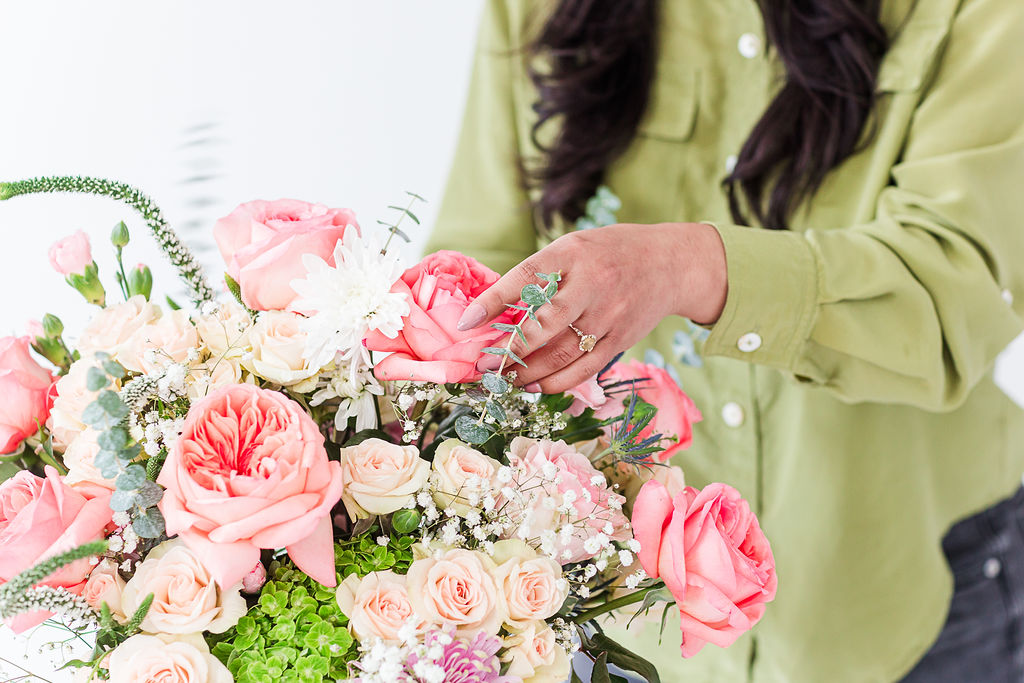
Choose a photo that captures the essence of your brand. That might be a confident headshot where you’re making eye contact with the camera, a behind-the-scenes moment of you doing what you do best, or a lifestyle image that shows your space, your vibe, or even your values. This image should feel intentional, aligned, and emotionally resonant with your ideal client.
Not sure where to start? Think about how you want someone to feel when they land on your site. Reassured? Inspired? Energized? Your photo should reflect that energy. And don’t forget to leave visual space for text or a call-to-action—your hero image works best when it supports your message, not competes with it.
When done right, this one photo sets the tone for your entire site. It invites people in, makes them want to scroll, and gives them a reason to stay.

2. About Page Photos
If your homepage is the welcome mat, your About page is the open door that invites people to step inside and get to know you. And yes—it’s that important. In fact, for many service-based businesses, the About page is the second most visited page on the site. Why? Because people do business with people they trust.
And trust starts with connection.
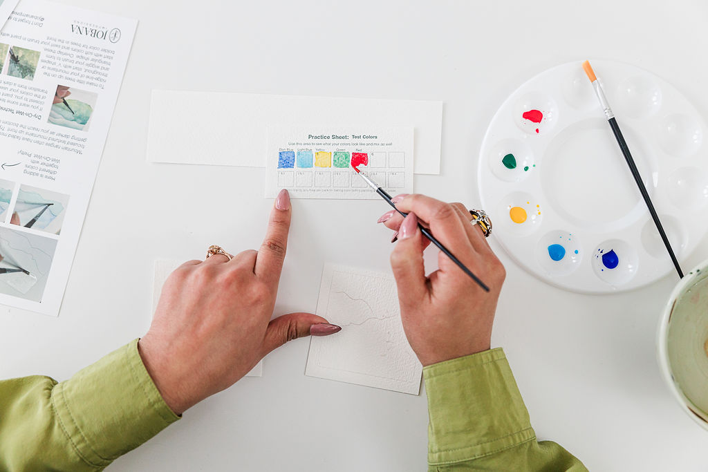
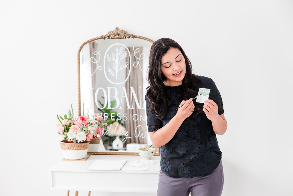
This is where your brand photos do heavy lifting. Don’t just rely on a single headshot—think of this page as a mini-storyboard of who you are and how you work. Include a professional portrait, of course, but also lifestyle images that feel authentic to you: a photo of you mid-conversation with a client, scribbling ideas in a notebook, or smiling with a coffee in hand. These small moments communicate approachability and credibility at the same time.
If you work in a physical space, show it. If you’re a digital nomad, show that too. Readers want to imagine what it’s like to interact with you—how you think, create, solve, lead. Your images help bring that to life in a way words alone can’t.
And here’s a bonus tip: consistency matters. Use the same brand colors, editing style, and wardrobe tone you use elsewhere on your site. This builds visual trust and makes your brand feel buttoned-up, cohesive, and confident.
Your About page isn’t just where people learn what you do—it’s where they decide if you’re the right person to help them. Make sure your photos send the message you want to be known for.

3. Services Page Section Headers
Your services page is where decisions start to happen. Visitors are scanning for answers: “Can this person help me?” “Do they understand my problem?” “Do I trust them with my time, money, or goals?” And while your words matter—your photos can say it faster and with more feeling.
That’s because images speak louder than words. A well-placed photo doesn’t just make your page more beautiful—it makes it more believable.
Instead of overwhelming readers with big blocks of text, break up your services page with intentional brand photos that align with each offering. For example, if you offer multiple services or packages, choose a different photo that reflects the unique vibe or outcome of each one. Coaching packages might be paired with an image of you in a thoughtful conversation. A group program could be represented with a collaborative moment, or a wide shot of you teaching or leading. A done-for-you service might call for a clean, styled flat lay of tools or tech.
Not only do these visuals add polish and personality—they also help potential clients visualize what it’s like to work with you. And when people can picture themselves in the experience, they’re one step closer to saying YES.
So the next time you’re wondering how to make your services page more engaging, don’t just edit the copy—look at the visuals. Your photos are doing some serious storytelling here. Let them speak.
4. Backgrounds, Details, and Design Elements
Not every brand photo needs to be a headshot to have impact. Some of the most valuable images from your brand shoot are the supporting players—flat lays, close-ups, textures, and workspace details that bring your visual brand to life in subtle, powerful ways.
These images are perfect for layering behind quotes, adding to banner sections, or breaking up longer blocks of text throughout your site. For example, a soft-focus image of your desk or tools can add warmth and personality to a section without distracting from the message. A styled flat lay in your brand colors can be used behind buttons, content boxes, or opt-in sections to keep your website feeling consistent and elevated.
These types of photos create a sense of cohesion across your entire site. They help fill in the visual gaps between your portraits and your copy, making everything feel more polished and intentional. They also ensure your website doesn’t rely on generic stock photos or overly designed graphics that feel disconnected from the rest of your brand.
The goal? To create a visual rhythm that makes your site feel well-designed, trustworthy, and unmistakably you.
5. Contact Page Imagery
Let’s talk about one of the most overlooked pages on your entire website: the contact page.
Think about it—if someone’s made it all the way here, they’re not just browsing anymore. They’re considering working with you. They’re thinking about reaching out, starting a conversation, or booking that discovery call. And in that moment, they’re often feeling a mix of curiosity, excitement… and a little vulnerability.
So don’t greet them with a blank form and a wall of text. Greet them with you.
A warm, smiling photo on your contact page can do more than just fill space—it creates reassurance. It humanizes the experience and reminds your visitor that a real person will be reading their message. A friendly, professional image helps reinforce the idea that you’re approachable, trustworthy, and ready to help.
This could be a casual, lifestyle-style image of you in your workspace, at your desk, or even looking directly into the camera with a soft smile. The goal isn’t to be formal—it’s to be welcoming.
So many websites miss this simple opportunity to build connection at a key decision-making point. But if you include the right photo here, it just might be the gentle nudge someone needs to click “send.”

6. Blog Article Photos
Think of your blog as a place where your brand gets to teach and connect. Adding thoughtfully chosen brand photos to your blog posts does more than just break up walls of text—it helps tell the story visually. Supporting visuals can reinforce the topic, create an emotional tone, and keep readers engaged longer. When your blog posts include on-brand photography, they not only look more professional, but they also feel more cohesive with your website, email newsletters, and social media content. It’s a simple way to show up consistently—and make your content instantly recognizable no matter where your audience finds it.
7. Join Newsletter Pop-Up
Your newsletter pop-up doesn’t have to feel pushy—it can feel personal. Adding a warm, inviting brand photo to your newsletter sign-up form makes it more approachable and more aligned with your overall brand experience. Whether it’s a smiling headshot or a behind-the-scenes photo of you at work, your image reminds people there’s a real person behind the business. That personal touch builds trust—and trust builds email lists. A well-designed pop-up with a compelling offer and a consistent visual vibe can dramatically increase sign-ups and help turn casual browsers into loyal subscribers.

8. Client Testimonial Section
Testimonials are powerful—but pairing them with the right photos takes them to the next level. Visuals help ground your words in reality and give potential clients a window into what it’s actually like to work with you. For example, you might use a photo of yourself mid-conversation with a client, leading a workshop, or working in your space. These types of “in-action” photos make the experience feel tangible and relatable. You can also include your client’s photo (with permission) to personalize their praise even more. The result? A testimonial section that feels authentic, and visually engaging helps turn browsers into buyers.


9. FAQ or Process Visuals
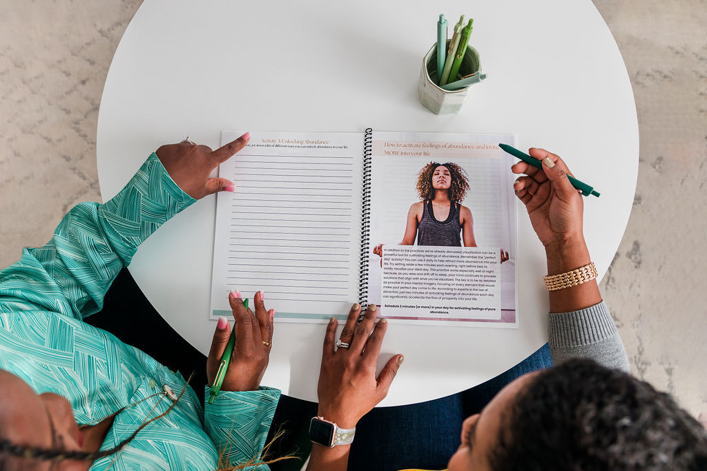
Your FAQ or “How It Works” section is a golden opportunity to calm nerves, answer common questions, and help people imagine what it’s like to work with you. Don’t leave it all to text—this is where your brand photos can shine. Include photos that walk your audience through your process: photos of your workspace, you in action with clients, your tools or setup, or even shots that represent each stage of your service. These visuals help demystify your process and make it feel more inviting. When potential clients can see what to expect, they feel more confident, more connected—and more likely to take the next step. If you have a process or frequently asked questions section, use photos that walk your audience through what it’s like to work with you. People love knowing what to expect.
10. Landing Pages for Specific Offers
Each of your offers—whether it’s a course, a freebie, a service, or a one-time event—deserves its own spotlight. A landing page is your chance to focus attention and guide visitors toward one clear action, and the photos you choose can dramatically influence how that journey feels. Use visuals that speak directly to the offer and the audience it’s for: a confident, friendly headshot if you’re promoting a 1:1 service; a photo of your product in use if you’re selling something tangible; or a lifestyle image that evokes the outcome of your course or event. The goal is to create emotional alignment between your words and your visuals—so when someone lands on the page, they feel like they’re in the right place. That alignment builds trust, reduces hesitation, and boosts conversions.


Stay tuned for Part 2, where I’ll share 10 ideas on how to use your brand photos across your social media platforms—and actually enjoy showing up consistently online.

